Last year, a client in Sanur approached us with an unusual request: "I need glass that helps me sleep." Her bedroom faced east, and the morning sun was disrupting her rest. After analyzing her space and needs, we created a stained glass panel using deep blues and soft violets that transformed her morning light into a gentle, calming glow. Within weeks, she reported improved sleep quality and a more peaceful morning routine. This is the power of color psychology in stained glass—it's not just about beauty; it's about how light and color shape our emotional landscape, influence our moods, and transform our wellbeing.

The Science of Color and Emotion
Color isn't just a visual experience—it's a physiological and psychological one. When light passes through colored glass, it creates wavelengths that interact with our retinas, triggering responses in the hypothalamus that affect hormone production, heart rate, and emotional states. This isn't new age theory; it's documented science. Studies show that blue light can lower blood pressure and reduce stress, while red light can increase heart rate and stimulate appetite.
In Bali, where the connection between environment and wellbeing is deeply understood, we've found that incorporating color psychology into glass design creates spaces that don't just look beautiful but actively support our emotional needs. The traditional Balinese concept of Tri Hita Karana (harmony with God, people, and nature) aligns perfectly with this approach—using color to create spaces that nurture all aspects of our being.
The Emotional Palette: What Your Colors Communicate
Each color family carries distinct psychological effects, but the specific shade, saturation, and context dramatically influence its impact. Understanding these nuances is key to creating glass that serves your emotional needs.
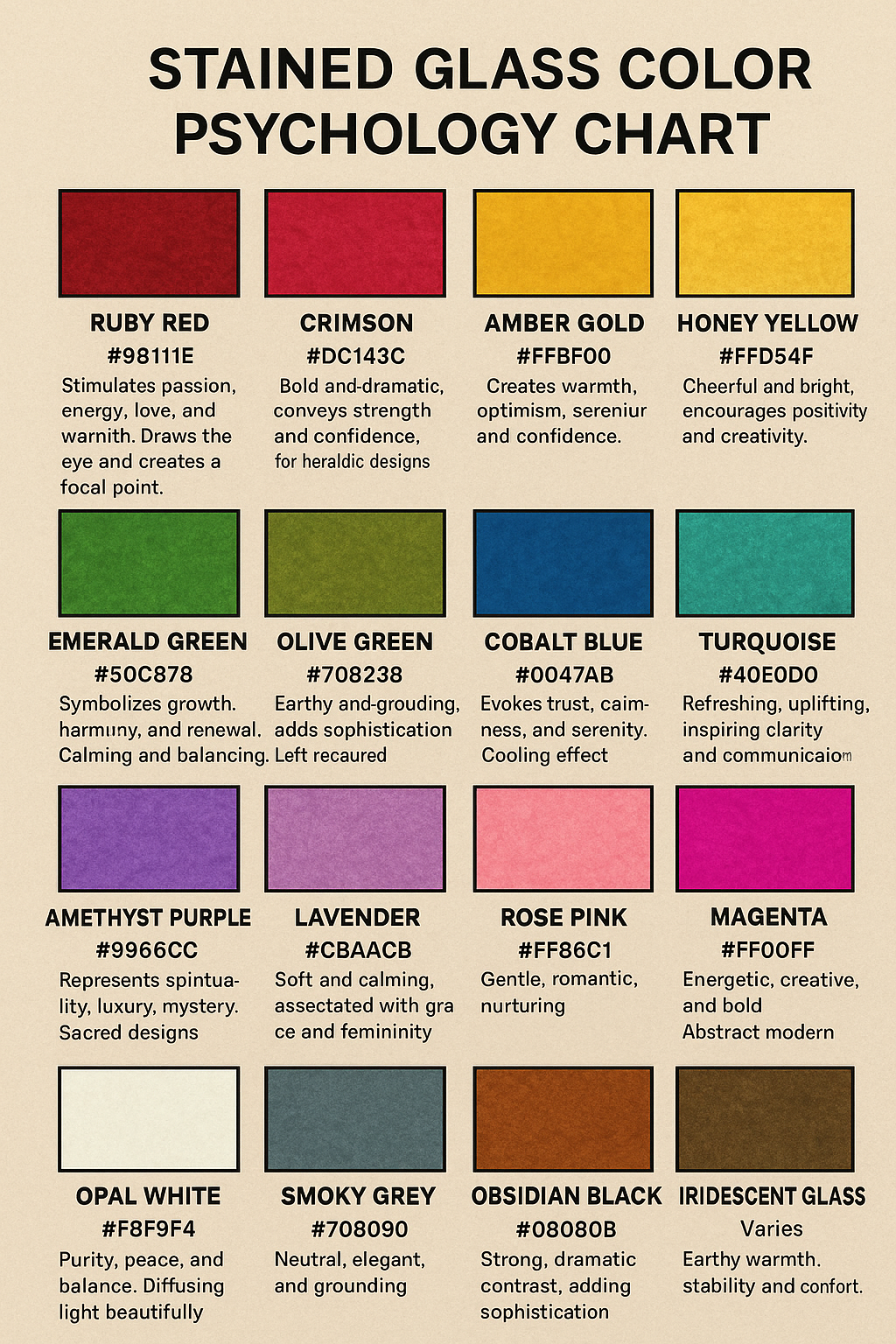
Psychological Effects of Key Color Families:
- Blues: From calming sky blues to deep ocean hues, blue is the most universally relaxing color. In stained glass, lighter blues create serene, meditative spaces, while deeper blues (like cobalt) provide grounding and introspection. Ideal for bedrooms, meditation spaces, and areas where mental clarity is needed.
- Greens: Representing nature and balance, greens in stained glass promote healing, reduce eye strain, and create harmony. Soft sage greens calm anxiety, while vibrant emerald tones stimulate creativity. Perfect for living areas, healing spaces, and creative studios.
- Reds: The most emotionally intense color family. Gentle terracottas and warm ambers energize without overwhelming, while deep burgundies add sophistication and intimacy. Use strategically in dining areas, creative spaces, or entryways where energy and connection are desired.
- Yellows/Golds: From pale lemon to rich amber, these hues stimulate mental activity and create warmth. Pale yellows enhance concentration (ideal for workspaces), while golden tones create welcoming, joyful spaces perfect for living areas and social spaces.
- Purples: Historically associated with spirituality and wisdom. Lavender tones calm and soothe (excellent for bedrooms), while deeper violets stimulate imagination and introspection. Particularly effective in meditation rooms and creative studios.
One of my most transformative projects involved a wellness center in Ubud that wanted to create different emotional zones within their space. We designed a series of glass panels using a carefully calibrated color progression: calming blues in the meditation room, restorative greens in the treatment areas, and energizing golds in the movement studio. Clients regularly comment on how the changing light through these panels intuitively guides them through their wellness journey, with measurable improvements in their reported stress levels and emotional balance.
Cultural Dimensions of Color Meaning
Color psychology isn't universal—cultural context dramatically shapes how we respond to different hues. In Western contexts, white often symbolizes purity, while in some Asian cultures it represents mourning. Understanding these nuances is crucial when designing for international clients or incorporating traditional motifs.
In Balinese tradition, color carries profound spiritual significance through the panca warna (five colors) system. White (ipis) represents purity and spiritual awareness. Red (meglaluh) symbolizes courage and vitality. Black (katep) stands for mystery and the unknown. Yellow (gede) signifies wisdom and prosperity. Blue (teges) represents divinity and infinity.
For a recent project with a Japanese-Balinese couple, we had to navigate both cultural color traditions. The husband wanted the calming influence of blue for his study (aligned with Japanese aesthetics), while the wife preferred the spiritual significance of yellow in Balinese tradition. Our solution was a gradient panel transitioning from soft blue to warm yellow, with the balance shifting based on time of day—cool morning light emphasizing the blue tones, warm afternoon light highlighting the yellow. The result was a space that honored both cultural perspectives while serving the room's functional needs.
Space-Specific Color Strategies
Just as different rooms serve different purposes, they benefit from different color approaches. The same hue can have dramatically different effects depending on where it's placed in your home.
Color Applications by Room Type:
- Bedrooms: Focus on calming, restorative colors. Soft blues, gentle lavenders, and muted greens promote relaxation and quality sleep. Avoid high-energy colors like bright reds or oranges, which can disrupt sleep patterns.
- Bathrooms: Create spa-like tranquility with soft greens and blues. For morning energy, incorporate small accents of warm yellows in east-facing bathrooms to gently wake you with the sunrise.
- Living Areas: Balance social energy with calming elements. Warm ambers and soft golds encourage conversation and connection, while strategic blue accents prevent overstimulation.
- Workspaces: Enhance focus with pale yellows and soft greens. For creative work, add accents of violet to stimulate imagination without overwhelming concentration.
- Meditation/Yoga Spaces: Use color intentionally to support your practice. Deep blues for introspection, soft violets for spiritual connection, or gentle greens for grounding and healing.
A memorable project involved transforming a challenging corner in a Seminyak villa—a space that felt disconnected from the rest of the home. We installed a stained glass panel using a carefully calibrated gradient from warm amber to cool blue. The magic happened throughout the day: morning light created a welcoming golden glow that energized residents as they began their day, while afternoon light transformed the space into a calming blue sanctuary as they returned home. The homeowners now use this corner as their daily transition space—a physical and emotional threshold between outside and inside worlds.
Personalizing Color for Your Unique Energy
While general color psychology provides a foundation, your personal associations with color are equally important. A color that generally calms might trigger anxiety if it's associated with a negative memory. True therapeutic design honors both universal principles and personal history.
During consultations, I always ask clients to share their emotional associations with different colors. One client loved the idea of blue for her bedroom but associated deep blues with a difficult period in her life. Instead of traditional calming blues, we created a custom blend using soft turquoise with subtle green undertones—a hue that provided the calming benefits of blue while avoiding her negative associations. The result was a space that felt authentically hers while still serving its therapeutic purpose.
For clients seeking deeper personalization, we sometimes incorporate color therapy principles based on chakra balancing. A yoga studio in Canggu requested a glass installation that would support their students' energy flow. We created a series of panels corresponding to each chakra, with colors calibrated to both traditional associations and the specific energy needs of each practice space. The studio owner reported noticeable shifts in students' energy and focus since the installation.
Design with Emotional Intelligence
Stained glass offers a unique opportunity to design with emotional intelligence—to create spaces that don't just look beautiful but actively support your wellbeing. When you understand the psychological language of color, you transform glass from mere decoration into a tool for emotional harmony.
The right stained glass design doesn't just change how your space looks—it changes how it feels, how you move through it, and how it supports your daily rhythms and emotional needs.
Transform Your Space with Color